I was blown away by your generosity about last week’s post. Thank you for welcoming my honesty and for being here. Writing Homeward and connecting with you all has been a joy! First up this week, my journey to finding the Platonic ideal of mixing bowls. Further down, Dan Barber’s vision for a more sustainable food system, including sparkling buckwheat soda and my (future) fave new chip flavor.
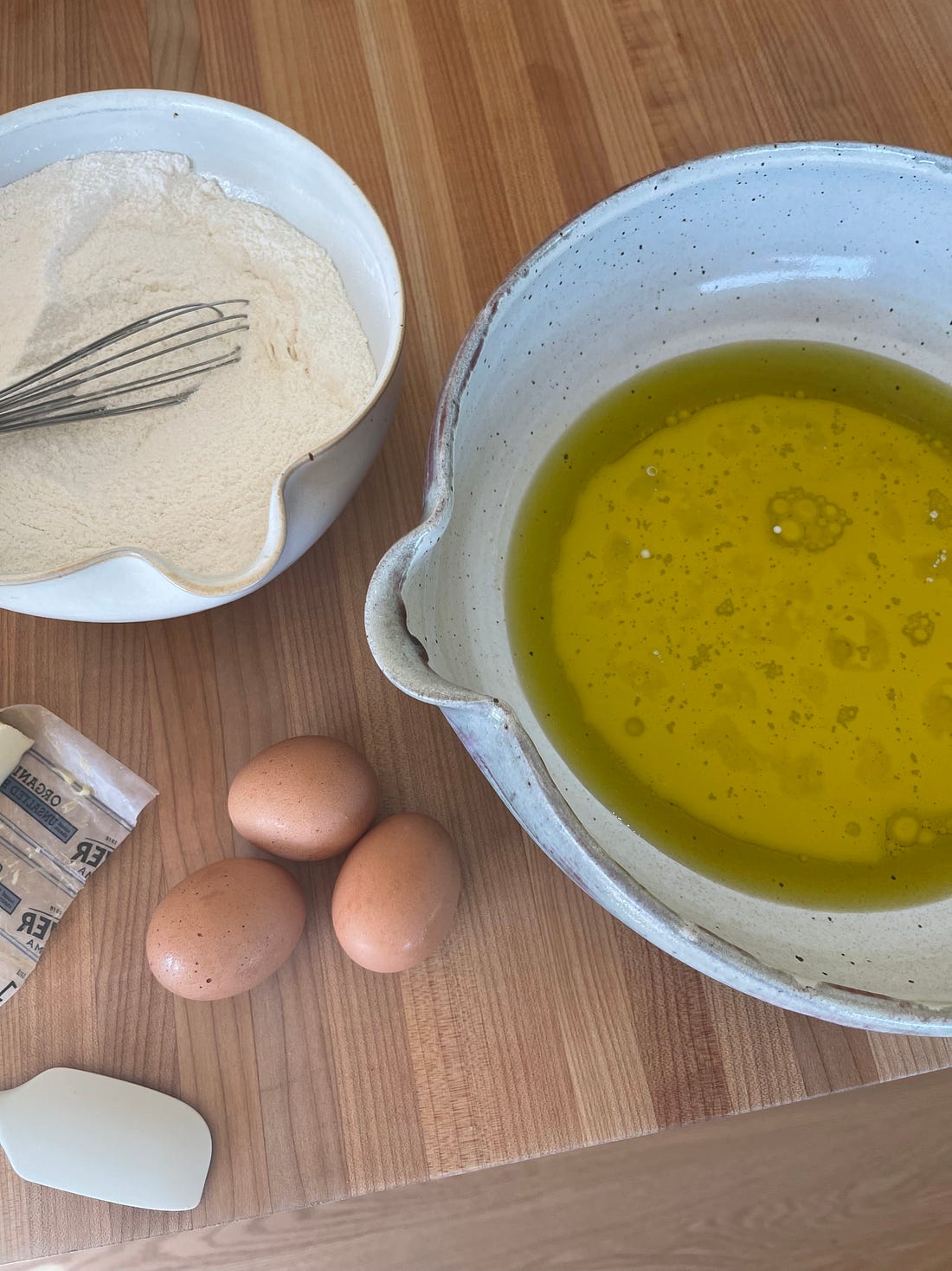
If I have a mission in life, it may be to design the perfect mixing bowl. I’ve searched and searched for one that’s just the right diameter and depth (wide and low) and also the proper heft so it doesn’t slide around when I’m mixing. It needs a spout whose lip is thin enough to cleanly stop the pour of liquids as well as of thick batters. I designed a ceramic set back in 2018 for Food52’s house line, Five Two. They sold out and then we had issues with the manufacturer and discontinued the set. Sigh. For Ojai, I bought Sori Yanagi’s steel bowls, which I’m a longtime fan of for basic prep. They’re sturdy and utilitarian but also a teeny bit design-y. They’re cherubically round, with thinly folded rims and a brushed matte surface. Accompanying strainers fit neatly inside each bowl. Still, the Yanagi bowls aren’t the ideal shape and they lack pour spouts. I wanted a stoneware set with all the right features. Subscribe to Homeward to unlock the rest.Become a paying subscriber of Homeward to get access to this post and other subscriber-only content. A subscription gets you:
|
Friday, July 10, 2026
My quest for the perfect mixing bowl

Friday, July 3, 2026
A very frank convo on money
Many of you have asked that I talk about how we budgeted for our house, and I’ve promised since the beginning that I’d write about money. I don’t see how you can write honestly or compellingly about home design without addressing the question of cost. Money is the subtext of every design detail. Not just how much you have, but your attitude about it, how much you value it, what your relationship with it is like. I’m going to be very open, and I ask only that you respond to my candor with grace. Having had family members who are on SNAP benefits, I’m particularly aware of my privilege: we are extremely fortunate to be able to afford a second home (or even a first one, as this next generation is experiencing)... Subscribe to Homeward to unlock the rest.Become a paying subscriber of Homeward to get access to this post and other subscriber-only content. A subscription gets you:
|
Friday, June 26, 2026
A chance encounter led me to this Julia Child-approved tool
A chance encounter led me to this Julia Child-approved toolPlus, a clever tote that goes from market to picnic to outer space.
Hi all, I hope you enjoy this week’s flurry of topics! Also, this post is FREE. If you like it, please share it! Yours in Julia nostalgia, Amanda
The Results of the Poll In a recent post, I asked you whether you’d like me to do a deep dive on tile or on bath hardware. It was a tight race! Tile won by a hair. So keep an eye out for my treatise on tile soon. ’Tis the Season As we enter the high season for outdoor cooking and entertaining, I put together a dedicated sourcing list, most of which is open to all—including trays, folding chairs, vintage lanterns, and shatterproof plates. Here are some of my faves: The full slate can be found on my Rec League.
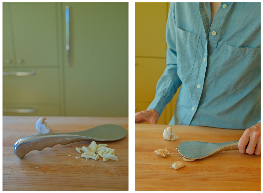
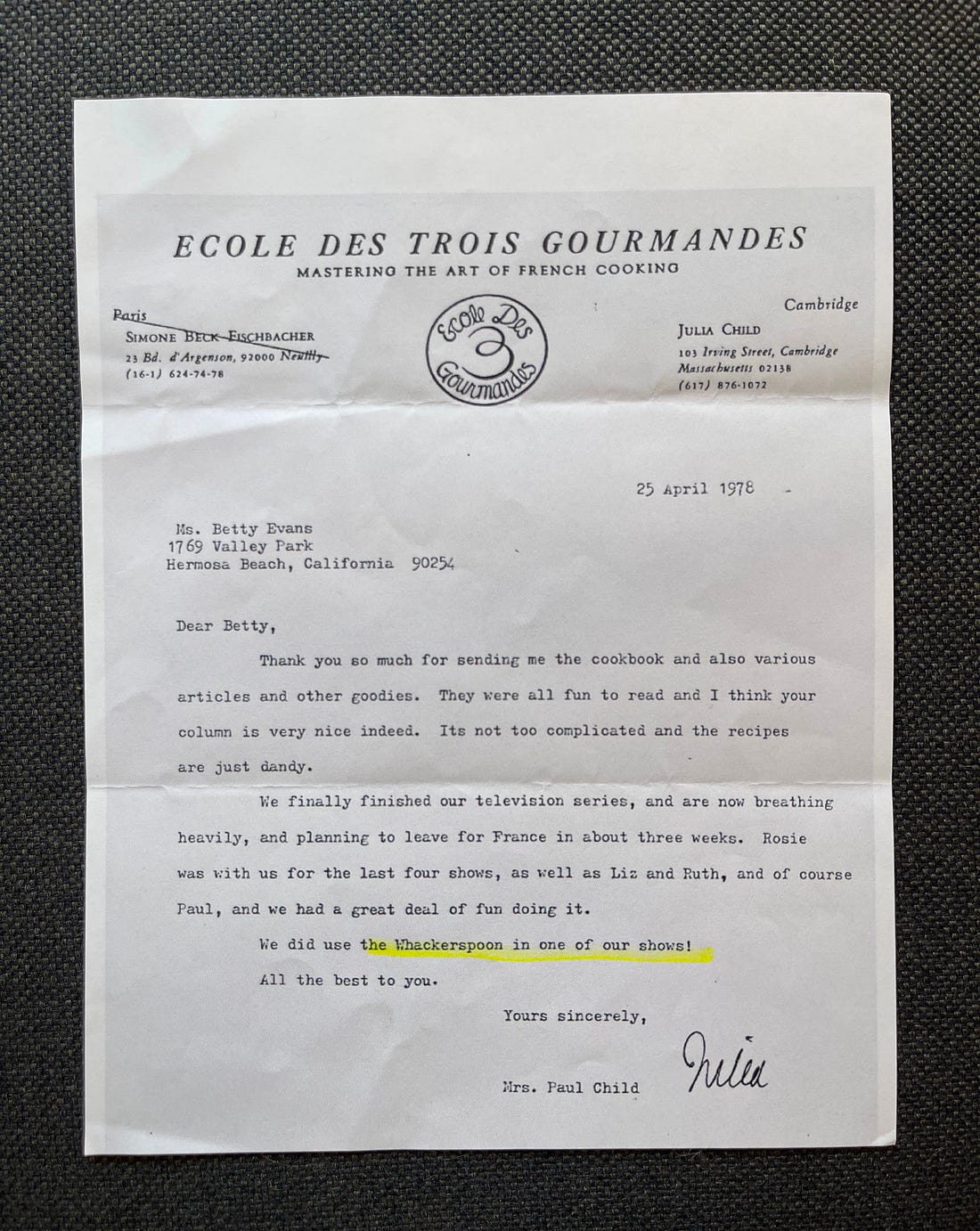
A few weeks after we moved to Ojai, I was headed to our mailbox when I spotted a couple who walked by almost every day, the woman sometimes carrying a set of swinging weights. They stopped to say hello. I got talking to Bob and Susanne, and learned they were entrepreneurs. Bob was born in Paris where his mother, Betty Evans, had been studying cooking around the same time that Julia Child was there doing the same. Although they didn’t meet in Paris, Betty and her husband Gordon later became friends of Julia and Paul Child, bonding over their Paris years. “Julia named a tool that I designed,” Bob said proudly. He had created a cast aluminum tool that local fishermen could use to pluck and pound the abalone they’d pulled from the waters off Santa Barbara, and he had it made in his grandfather’s foundry.
When Betty showed the tool to Julia, she slapped it in her palm and said, “This is not a plucker and pounder, it’s a whackerspoon.” She later used the whackerspoon to make steak Diane on an episode of “The French Chef.” Its handle is ribbed so it fits nicely in your grip, and its pleasing weight enables you to flatten chicken breasts, crack spices, smash garlic cloves, and crush olives or nuts. The Whackerspoon is available here.
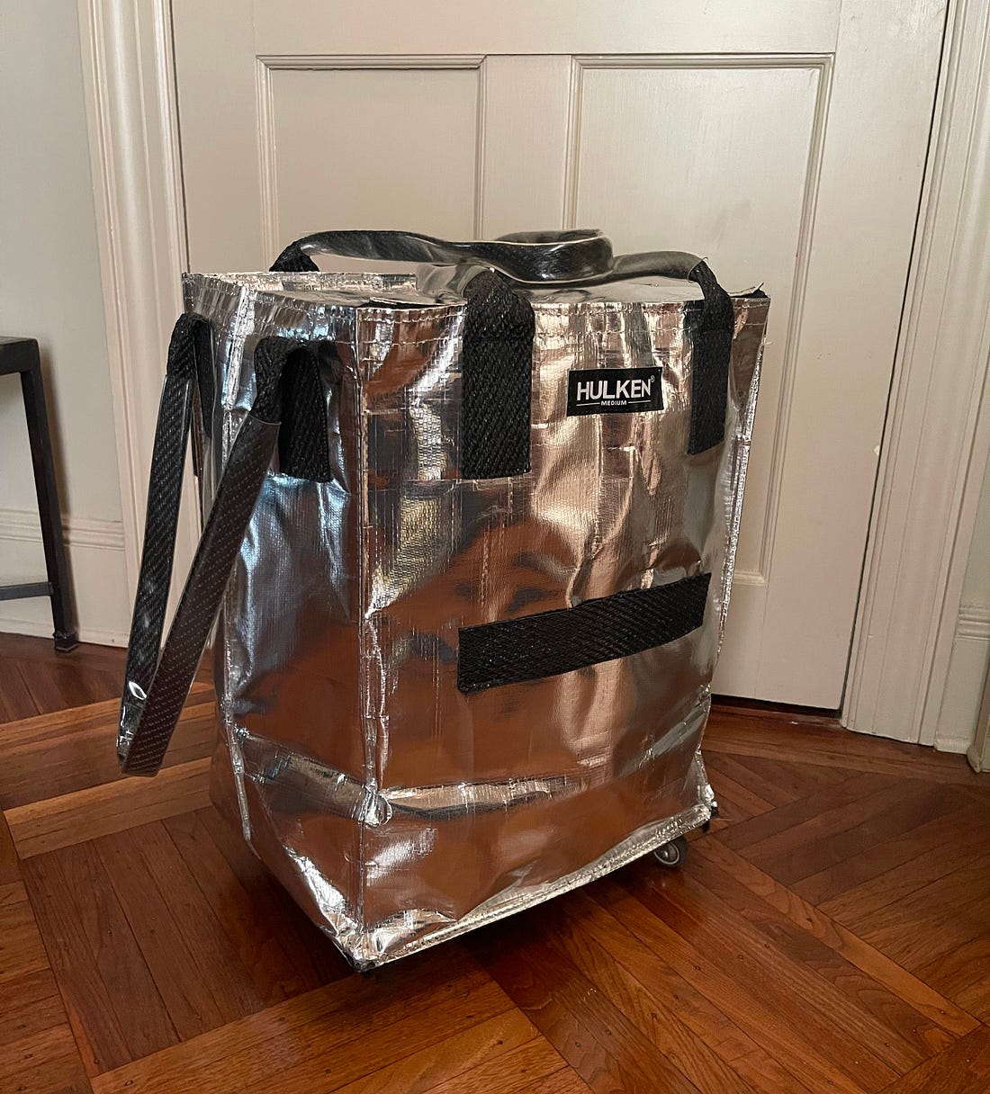
My friend Alex came by with this insulated wheelie bag by Hulkan that looks like it’s ready for the International Space Station. He said, “it’s like the IKEA bag’s cooler cousin.” It’s a super well-thought-out design for farmers’ market shopping, picnic toting, and any other time you need to transport something heavy or cold. The spinner wheels are smooth and nimble (like the ones on a great suitcase) and the handles have thick plastic covers so they won’t get gross. There’s one loop for pulling the bag like a wagon, two for carrying it, and thick straps on the sides for hauling it up stairs. Then, the whole thing folds flat. And it’s all wipeable. Oh, and it comes in other colors, too, but I’m kind of into this space cube.
Did I mention I’m writing a book based on Homeward? And that I’d love to include your voices/opinions/anecdotes in the book? I’m going to ask you questions and I’d love to hear from you in the comments below. (FYI: If you comment, you give me permission to publish your comment in part or in whole.) Don’t worry, I’m only going to use the most colorful and detailed comments (and am only using first names), so fire away! Here’s my first question: When does a home feel done… or does it ever?
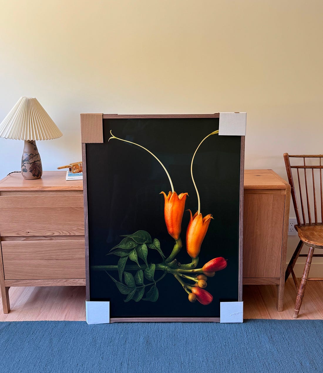
When we left Ojai for the summer, there was just a single piece of art up in the house, a fresco of Tad as a child that’s been in his family for 60-ish years. We don’t really have a plan for art yet. This is partly because we’ve put our checkbook in the freezer for a while. And partly because after making a flurry of design decisions, we were looking forward to treating art more like a journey. Still, I have to admit I craved having some walls feel less bare. Our designer Frances introduced us to the photographer David Hartwell, who did a series of painterly photos of weeds and flowers from his back garden in Pasadena. We fell hard for a photograph of a trumpet vine. We also discovered The Framing House, a wonderful shop in L.A., who advised us by phone on the best way to frame it. The photo is going in a guest room.
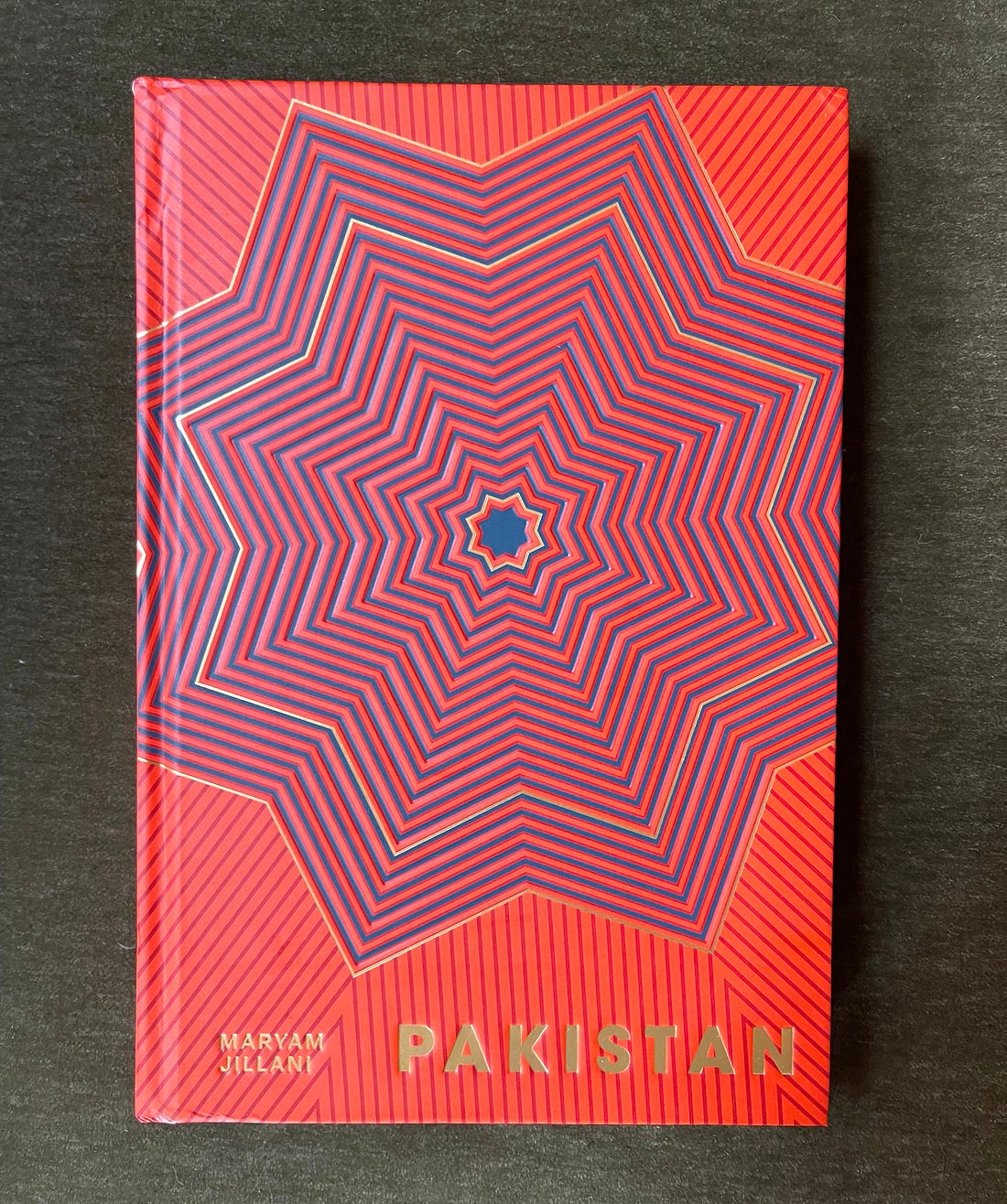
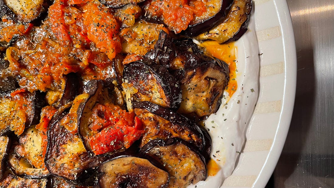
I’ve had the book Pakistan wedged into my not-yet-shelved book stack for many months. I was looking for a new summer side dish, and found it in Afghanistan by way of Pakistan. Maryam Jillani, the author, reminds us that Pakistan, which is situated between Afghanistan, China, India, and Iran, has long been a conduit not only of trade, but of cuisines. She writes about nanhkatai, a shortbread popular across Bangladesh, India, and Pakistan; Punjabi chicken with chickpeas; and the Afghan-style fried eggplant in yogurt. Jillani’s book is a reminder that every cuisine is interconnected, and that the most interesting dishes often emerge when they overlap. One disclaimer: I subbed coconut yogurt for whole milk yogurt. It was great but the choice is yours. Borani Banjan | Afghan-Style Fried Eggplant in Yogurt Serves 4 to 6 as a side
Ingredients:
Instructions:
Here’s how I made out: 
If anyone else needs to see this recipe—or a cosmic carry-all, or a niche-but-very-necessary whackerspoon—please feel free to share this post!
|